 |
| Figure 8. Local sea-level rise (mm/year) around Australia from the early 1990s to 2008 |
Here's my version, based on the same data, but starting from 1999, at the end of the late 90s ENSO "ramp" which grossly distorts the "early 1990s to 2008" rates shown above.
 |
| Local sea-level rise (mm/year) around Australia from 1999 to 2010 |
The CC source is quoted as "NTC (Bureau of Meteorology). (2008). The Australian Baseline Sea Level Monitoring Project, Annual Sea Level Summary Report, July 2007 – June 2008". "The Critical Decade" cites several references from 2011, so why didn't they use the report from June 2010? A cynic (I'm one) might conclude that they didn't because that 2010 report shows lower figures for those examples I quoted. A cynic might ask why they chose to use data "from the early 1990s to 2008" when they appears to think that "shorter term" (10-15 years for trends in ice-loss from polar ice-sheets) is generally too short to project long-term trends from, yet choose to use a coarse summary of sea-level data of duration 16-19 years for their report, and to express an opinion about the extracted statistics. They say about trends in ice-loss from polar ice-sheets:
In addition, these trends are often based on shorter term observational records (often the last 10-15 years), and it is not entirely clear whether these are long-term trends that will be maintained into the future or are at least partly the result of natural decadal-scale variability.They might have made a similar observation about sea-level, especially as they ascribe a large part of sea-level rise to ice-loss from the polar sheets, but chose not to. Below their map, they say
Global average values of sea-level rise mask large regional differences. For example, around Australia (Figure 8) recent sea level rise (from the early 1990s to 2008) has been below the global average along the east coast, near the global average along the [sic] much of the southern coast, but at least double the global average along much of the northern coastline. Such regional differences are important in assessing the risks posed by sea-level rise at particular locations.
Indeed they are, but at what particular locations? This ABSLMP page on the Bureau of Meteorology website give us more than a clue. It turns out that the "somewhere near Darwin" I quoted actually is Darwin:
 |
| Source: Bureau of Meteorology |
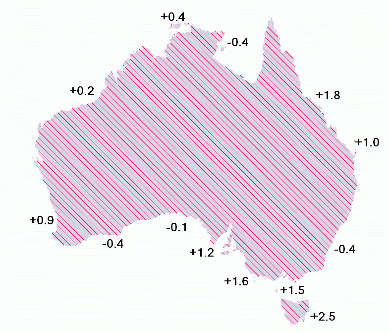
The point I'm making is that by using a yearly average over a relatively short period (16-19 years) which includes a 3-4 year rise representing almost all the net rise which occurred over a 50 year period produces a completely misleading and distorted picture. If we look at annual averages for Darwin, there was a net 20cm rise between 1966 (data before then is rather patchy, with mostly incomplete years) and 2010. That translates to an average 20/45 = 4.4 mm/year. The ABSLMP database comprises 15 stations around the mainland and Tasmania. let's see what's happened after that large ENSO rise in the late 1990s I mentioned earlier (clockwise from Darwin):
| Station | 1999-2010 |
| Darwin, NT | slightly up (0.4 mm/yr) |
| Milner Bay, NT | slightly down (-0.4 mm/yr) |
| Cape Ferguson, QLD | increasing (1.8 mm/yr) |
| Rosslyn Bay, QLD | increasing(+1.0 mm/yr) |
| Port Kembla, NSW | slightly down (-0.4 mm/yr) |
| Spring Bay, TAS | increasing (+2.5 mm/yr) |
| Burnie, TAS | slightly up (+0.8 mm/yr) |
| Stony Point, VIC | increasing (+1.5 mm/yr) - unadjusted shows -0.7 |
| Lorne, VIC | increasing (+1.3 mm/yr) - unadjusted shows -0.9 |
| Portland, VIC | increasing (+1.6 mm/yr) |
| Port Stanvac, SA | increasing (+1.2 mm/yr) |
| Thevenard, SA | no trend (-0.1 mm/yr) |
| Esperance, WA | slightly down (-0.4 mm/yr) |
| Hillarys , WA | slightly up (+0.9 mm/yr) |
| Broome, WA | no trend (+0.2 mm/yr) |
The average of the un-rounded trends for all 15 stations is +0.7828 mm/year.
Here's the full record for Darwin, from non-ABSLMP data 1966-2010. I've converted the data (in all plots) from metres to mm to maximise precision in Excel trends. Note that there's little net change after a sharp rise to 1998/9 (Click to enlarge)

Here's 1998-2010 in detail, using ABSLMP data (which is adjusted for changes in land level) The trend slope is 0.0346 x 12 = 0.4152 mm/year.

Note that there appears to be little net rise at Darwin between 1966 and the mid-1990s. Here's that period in detail. The difference between the trend line above and the one below is almost 100 mm, and accounts for very nearly all of the rise shown for the entire period 1966-2010.

Darwin was the first of the sites I analysed some weeks ago, and the 1966-1996 trend was the first I tried. At first I thought that I or Excel was in error - the line was totally flat, and I realised that there was nothing amiss when I hit on displaying the trend equation (shown on the right). The slope of the line is less than one screen pixel high - less than 0.1 mm/year.
Most of the sites with longer records display a similar flat or nearly flat trend before 1997, and I'll go into more detail in a future post. I'll also link the individual 1999-2010 plots from the station table above, in case anyone's interested, and to tidy up loose ends.
The best antidote to alarmism is data, and the best way of administering that antidote is reasoned analysis.
No comments:
Post a Comment