A couple of years ago, I read what I considered to be an outrageous claim - that the Tidal Unit (formerly National Tidal Centre) of the BOM was publishing "exaggerated data" in the ABSLMP (Australian Baseline Sea Level Monitoring Project) series. Worse, that the data was "homogenised". Well, it's impossible to "homogenise" tide-gauge data. Each gauge uses a different base-line for measurements, referred to as "Tide Gauge Zero". It's a "virtual" reference level, referenced to a physical benchmark (the TGBM or "Tide gauge Bench Mark") at the gauge site, one of a set, the remainder being on the adjacent dockside or land.
I'll relate the full story in a later post, but for now just let's say it concerned the record for Sydney, and that for Port Kembla, some 64Km to the south. Here's the full chart for Sydney, to October 2016.
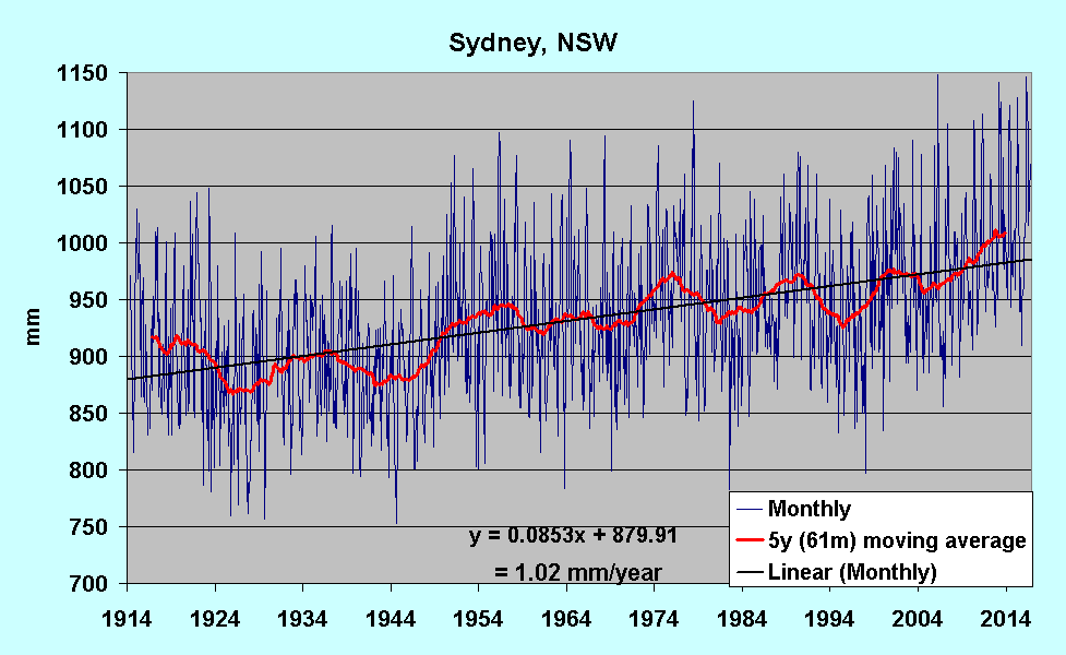 |
| Sydney 1914-2016. Source: BOM |
While the long-term rate for Sydney is 1.02 mm/year, it's easy to see that any short-term rate depends entirely on the start point. Start in 1997 or 1998, when there was a "dip" due to the 1997-8 El Niño, and you get a very high trend; start in 1990, a much lower rate. I've plotted the rate for a 20-year sliding window, using annual average data:
 |
| Rate (mm/year) for 20-year sliding window; end year on X-axis. |
Port Kembla (an ABSLMP station), installed in 1991:
 |
| Port Kembla 1991-2016 Source: BOM |
Sydney 1990-2016 for comparison.
 |
| Sydney 1990-2016 Source: BOM |
Both together, after Port Kembla data adjusted by +58mm - the offset due to the different "Tide Gauge Zero" benchmarks.
 |
| Sydney & Port Kembla compared; 1991-2016 |
The claim of "homogenistation" is egrarious bullshit, invented by the morally, evidentially and statistically challenged. Put even more forcibly, it's a lie.
On to Fremantle, another source of claims and misinterpretation. The full plot first:
 |
| Fremantle, WA 1897-2016 |
This is the chart for Hillarys (Boat Yard), on the far side of Perth from Fremantle, to the north.
 |
| Hillarys, WA 1992-2016 |
Fremantle 1992-2016 for comparison:
 |
| Fremantle, WA 1992-2016 |
And both together, with Fremantle adjusted down by 64mm:
 |
| Hillarys/Fremantle over-plotted; Fremantle adjusted down by 64mm |
Hillarys starts somewhat lower than Fremantle, but they plot together from 2002 onwards. It's easy to show such correlation between adjacent stations around Oz, even if they're several hundred Km apart. Even if it were possible to "homogenise" gauge data, the tides do a perfectly good job already.
Data is sourced from The main BOM Tidal Unit for Sydney and Fremantle, and from the AMSLMP project for Port Kembla and Hillarys.
NOTE: I've just discovered that SONEL have updated with data for many Oz stations. The CGPS pillars are often very close to tide gauges. At Hillarys they're co-located, and the latest plot shows a drop of 2.78 mm/year:
 |
| Source: SONEL |
Updates include data for many of the Pacific islands, including Sceptic poster-child Tuvalu. Watch this space.
No comments:
Post a Comment